Scalable Mobile Designs
Big interactions on a small screen
“The interaction is just too complicated to be practical on a handheld device.” Or “There’s too much information for it to work on a phone.” For UXers who believe in universal design and the importance of giving people the freedom to use our software in whatever way works for them, these statements have damaged many promising projects. Thankfully, there are cases that prove complex isn’t synonymous with desktop only.
The Problem of Scale
The sheer volume of data we needed to make sense of was the limiting factor for much of our work
Data mining is, by definition, an enormous undertaking. It involves reverse-engineering text, images, audio, and logic, then redisplaying everything found in a flat, consumable format. In my case, we were spending our free time trying to make a 200-hour game available in 12 languages with branching paths discoverable for gamers who didn’t have time to try every combination. My partner and I were the main clients of this effort, both as fans of the game and as a development team who wanted to keep their skills sharp.
Step one was clear given this problem - understand what data was available to us. That meant a lot of slogging through spreadsheets and categorizing the chunks we could make sense of. This culminated in an initial site that was more debugging than design to wrap our heads around the scope.
Designing for Internationalization
Early on, we decided that if the game we were mining had been released with twelve different languages supported, we would need to support the same on our site to help our fellow fans. Unfortunately, between the two of us working on the project, we didn’t know all those languages. If we were going to use Google Translate to roughly translate anything we wrote, we might as well just leave it in English since browsers like Chrome could handle that themselves.
This lead to some creative problem-solving where we used snippets of the game menus to drive much of our navigation. It required rethinking much of our information architecture since we wanted to minimize the use of hardcoded English outside of our project description. We also had to rely on our own rough knowledge of 3-4 of the supported languages, including the original Japanese, to ensure we didn’t latch onto the wrong titles due to ambiguous translation. Some friendly translators in the community were of great help with this step.
One example of what we faced: “Menu” as in a navigation element vs. “Menu” as in something you order food off of. The game had both.
A sample in our native language (English)
The same sample in Japanese. ‘Birthday’ is the only word we weren’t able to translate using the game’s data.
The same sample once again in French. Note that even the order of the date changes correctly without needing custom code.
Audience Drives Scope
As the months dragged on with our dev-heavy work of parsing the data, it became clear we needed to tighten our scope if we intended to go public with the site. Normally, we would have started with this step, but it wasn’t until we asked the gaming community for help in refining our data that we realized just how many other people this could benefit beyond us or translators. Thus began a new definition of who we wanted to serve and what we considered important for them.
The ‘fun part’ of the branding exercise after determining an audience: sketching logos.
Part of this was a thorough branding exercise. The other was an assessment of our community, both from observation and polls. We concluded that we were after three major audiences: casual fans who had played the game and wanted to learn more about their favorite characters without dropping even more hours to explore all the options, translators who wanted to compare between the original language and the localization familiar to them, and fans who enjoyed deep analysis of the game for the enjoyment of the community or writing of fanfiction, often while on their phones.
This made us realize we needed two additional things to release: a solid search across the thousands of lines of game text and a mobile site with no functionality loss.
Single-Functionality Pages
Mindful use of autocomplete and few actions on a page can make even massive pages of text more usable
We worked through many iterations for mobile before we realized the key to a successful design with such a robust data set. Only one idea per page. One major interaction to worry about makes the pages feel comfortable to our target users, even if a lot of scrolling is involved. Searching and jumping where possible also help with this.
Unfortunately, that did mean we ended up with many more pages than we originally anticipated. Every item, every book, every quote category, every battle, and every scene has its own page. It was enormously difficult to test given our two-man operation, even with the help of some peers, and we still get corrections a year later. However, we have never received complaints about the usability of the mobile site since adopting this technique.
Still Going Strong
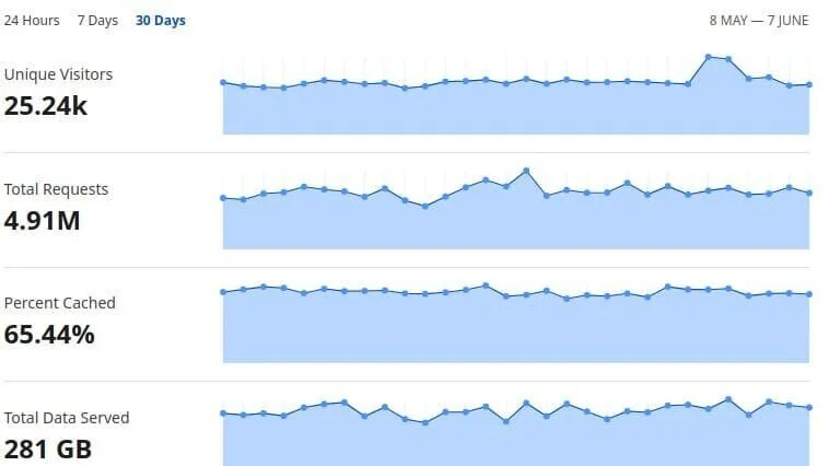
Although the game we datamined is now several years old and we haven’t actively advertised or maintained the site since a large kickoff event I orchestrated at its launch, fedatamine remains in heavy use today, with about 25k users per month, 57% of which come from mobile devices, and 60% of which are from outside the United States.
Usage statistics for May 8. 2021- Jun 7, 2021, showing 25.24k Unique Visitors


